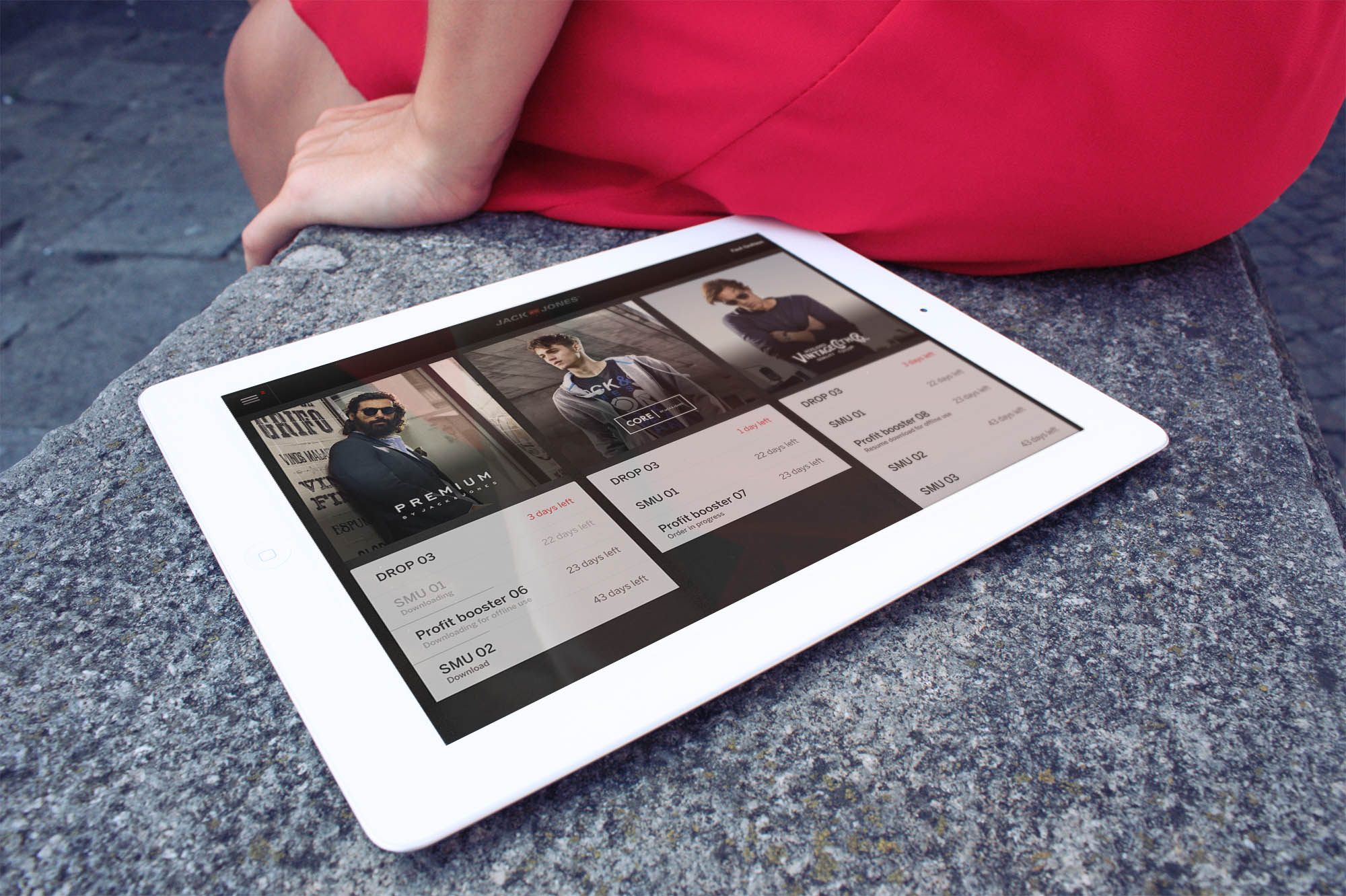
Jack & Jones Frontline app
The project
This project was not about creating a store in an app – it was about changing the infrastructure of an entire company. It used to be that when retailers want to purchase clothes for their shop, they had to go to a showroom many times a year to select the items they wanted to carry in their stores – and to add insult to injury it would often take months before they received the items. Jack & Jones wanted to change this and optimise this process, and from that the Jack & Jones Frontline App was born. The goal was simply to remove logistical challenges and empower the retailers to become better sellers.
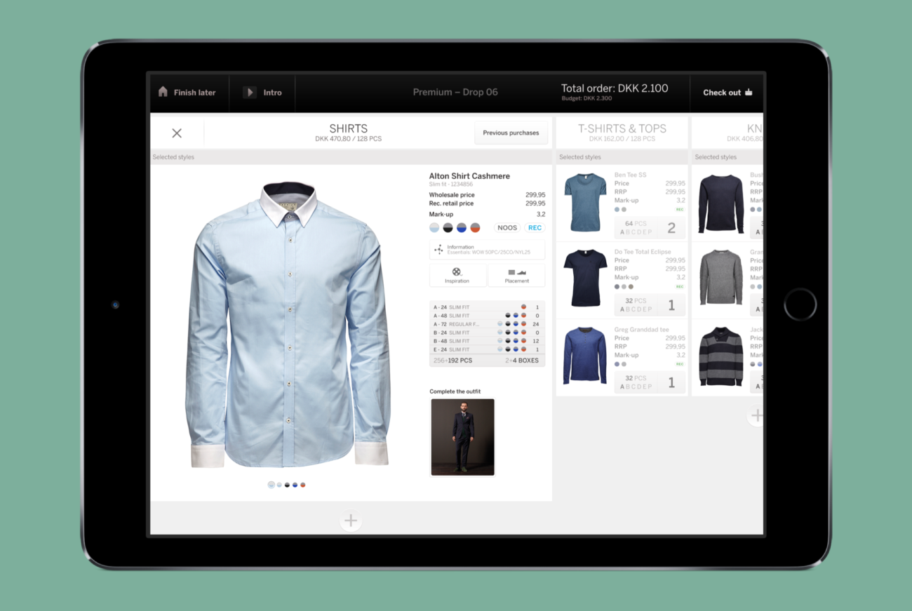
Since the goal was not only to simplify but also to empower, we had to guide retailers to make better purchasing decisions. The app thus ended up being not only an e-commerce platform but a showroom and an academy as well. For this we created an interactive video guide showing seasonal trends and key outfits to introduce the retailer to the thinking that went into the designs – so they could more easily communicate this to the end users. We also made the somewhat presumptuous decision of pre-filling the users baskets with a recommended selection based on their budgets and geographical location, to make sure they could easily purchase the right items for their stores.
With this app we drastically changed the relationship between Jack & Jones and it’s retailers, and empowered the retailers to focus on their core business – selling clothes.
Client:
Bestseller
Year:
2015
Giving access to tons of information in a simple interface
This enterprise application had to contain a lot of information and functionality. We created a simple interface by working with substates that were easily accessible. We put immense focus on transition design to create the feeling of being on one page and never loosing focus. Both storyboards and textual explanations guided the implementation of transitions.The overview gives information about all the selected products in the different categories. As a user you will see the preselected items first, but additional items are shown when tapping the plus. This is to give you a simple overview of the styles that have been selected for you. Tapping on a category header expands the category and gives a full overview of available and purchased products in the category. The user can then tap to expand an individual item to reveal additional information like access to fabric type, store placement advice and styling tips.


