Top

Lauritz Mobile App

Lauritz is one of the biggest auction houses in Denmark with more than 1 million customers. There are constantly around 8000 products for sale going through a 7 day countdown. With new products always coming in, it was essential to give the users an easy way of finding these products. Lauritz’ current website is over 10 years old, so the app had to be the guideline for both a new visual and interaction style.


My involvement

Concept

Interaction design

User testing

Prototyping

Motion and animations

Quality assurance

42% of all auction bids are placed through the app

It has been downloaded more than 350.000 times

The app has more than 150.000 active users

On a monthly average, an app user views 130 pages compared to 33 pages on the web

On a monthly average, an app user spends 68 min browsing the app compared to 24 min on the web

The work received two awards at the Danish Internet Award in the categories ”Mobile Presence” and ”Retail” and won best ‘Shopping & e-commerce’ app at Danish App Awards.


Keeping focus on the elements that drive actions

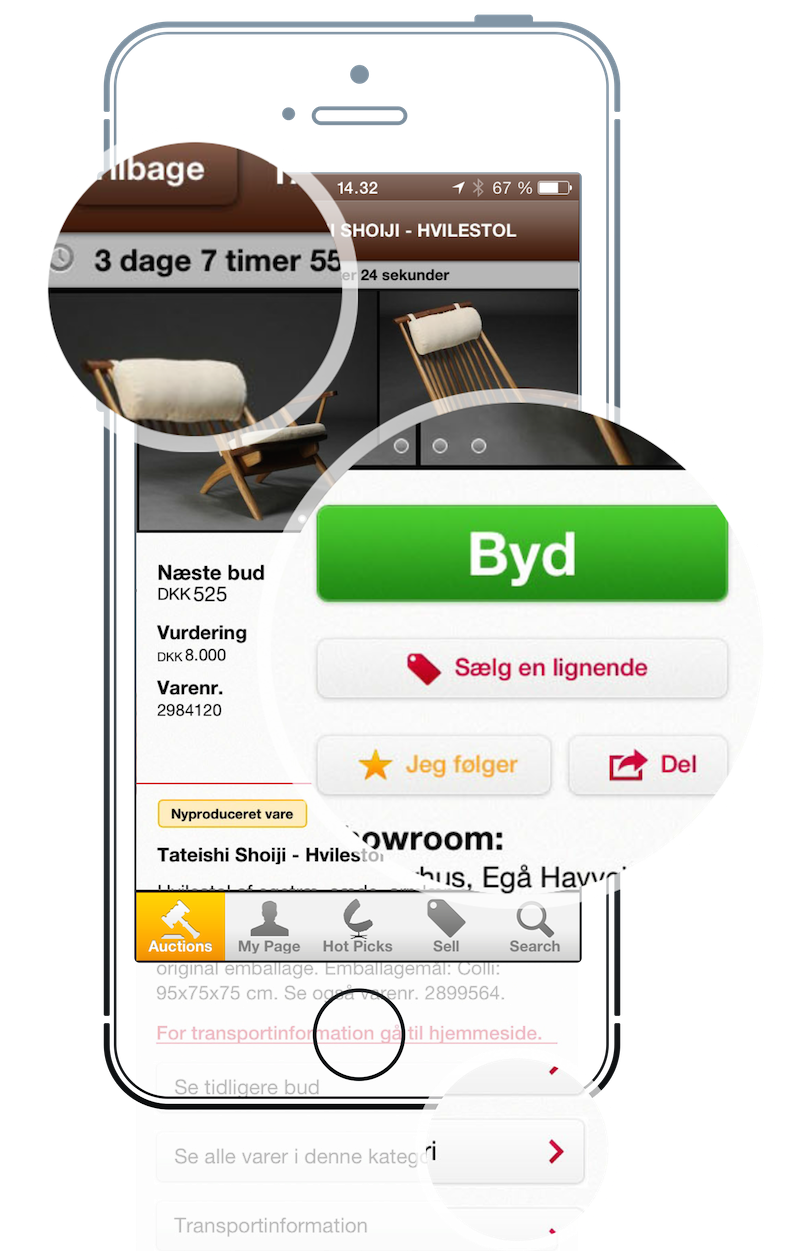
In the hierarchy of information, we focused on the information that was proven to drive decisions. Using user research and analytics we convinced the client that not all information should have the same weight.

The counter shows users exactly how long is left in a way that is engaging and again reinforces the urgency. Next all the buttons that are most valuable to the user is prominent on the screen, inviting to take action. Lastly to create this focus we layered secondary information in subpages as not to clutter the interface.



Creating a simple and image centered design

Lauritz’ previous design style was showing a lot of information in one view, and having a lot of focus on text. I am very proud of having succeeded in changing their style towards a simpler interface and a heavier focus on products.

The first thing the user sees when opening the app is a curated collection of what Lauritz find to be their most interesting products. The user can slide columns horizontally and vertically. This is to give the feeling that there is no beginning or end to the products.

It was a difficult process to convince the business to let their products stand alone without text, but the data now shows that this drives longer user sessions and higher engagement. The time tag at the top updates as you scroll, to let you know how long the products in view have until they are sold – creating a sense of urgency.