Top

The project

Insurance is a low interest topic – which most people only care about when they have had an accident. Knowing this the insurance trade association in Denmark wanted to make their tool for comparing insurances so easy and fast to use, that more people would be enticed to optimize their insurance portfolio


My involvement

Concept

Interaction design

User testing

Prototyping

Motion and animations

Quality assurance

   
CLIENT:

Forsikring og Pension

When:

2014

Industry:

Insurance


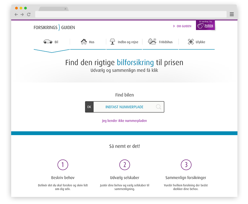
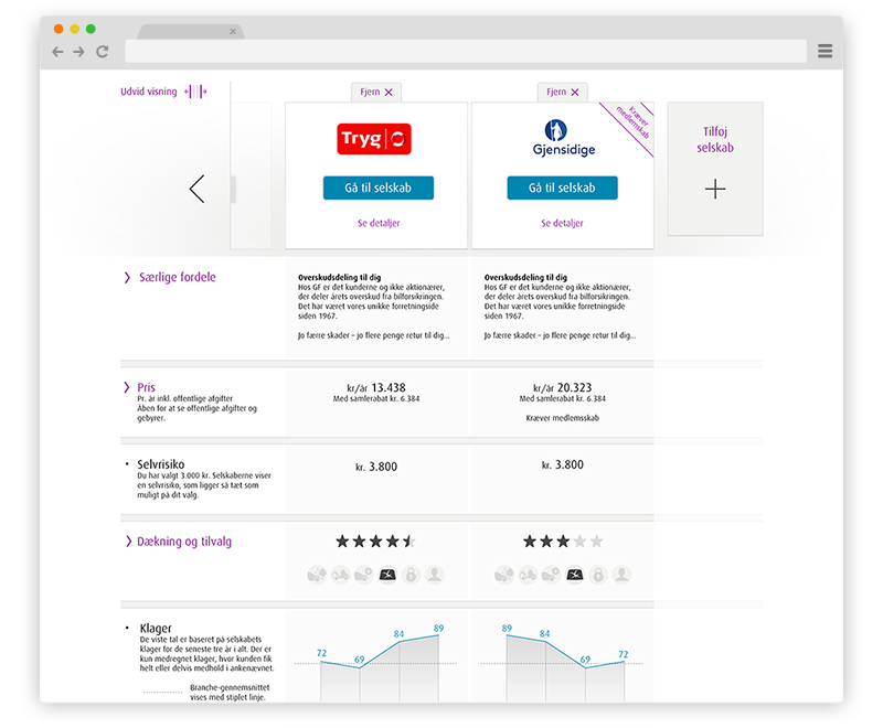
Making the tool simple and understandable without leaving out information

Insurance details can fill pages upon pages with small print information, and as a trade organization it naturally important that all of these details are available in the tool. The problem was that showing all of this information would cause paralysis, and the users would leave without fulfilling their goal.
We therefore worked a lot with layering of information always showing the conclusions in the first screen and letting users dig through the layers if they needed all the details. We tried to use data visualisations as much as possible to make the information understandable and enticing.


Showing results from as little information as possible.

In the design process we were working closely with representatives from almost all the insurance companies in Denmark. Since they had to providing the products that we would compare in the tool, they naturally had a say regarding what information the users needed to provide in order to show an accurate offer. Their wishes were often in conflict with our goal of making a simple, fast and easy tool.

We solved by using data registers that could gather all information about your car or house and by defaulting a lot of questions to the most probable, and letting users tweak this afterwards